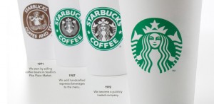
Starbucks is the most well known coffee company in the world. So why is it suddenly putting a Gapfu and changing its logo? Gone is the actual NAME of the company and what remains is a slightly different, stylized version of the siren that’s been present on every Starbucks cup since the company launched. I am personally not a fan of the new logo, but I will inevitably still buy their coffee and frequent their shops, but it remains to be seen how the public will react to the new branding. One entirely credible publication said that the new logo had satanic imagery embedded within the siren’s crown (ie. the pentagram on top of her head) but I’m not sure how far that story is going to fly.
Besides the fact that I dont think the new logo is very attractive without the company name surrounding it, the move is a ballsy on Starbucks part simply because they’re banking on the fact that their signature logo – the siren – will be recognizable even without having the words ‘Starbucks Coffee’ on the cup. The green and white combination is enough at this point. It goes without saying that this is on the level of McDonalds in branding power, when the colors of a company spark the thought of them. You would never have a red and yellow wedding would you? No… because your family would say it looks like McDonalds. That’s powerful stuff people! Perhaps someday blue and white will be synonymous with Integraphix!
What do you think of the new Starbucks logo?
Chicago Marketing Company

No comments:
Post a Comment